The best source of information for all new Tatem releases, updates, and improvements. Stay in the loop.
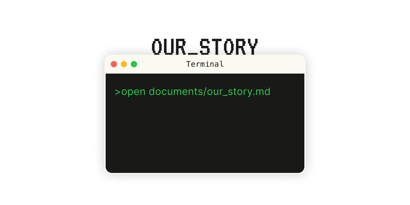
Read the Tatem Story. Become a part of the chapters yet to be written. Make a mark on history. Or, at the very least, make a mark on our history.