The best source of information for all new Tatem releases, updates, and improvements. Stay in the loop.

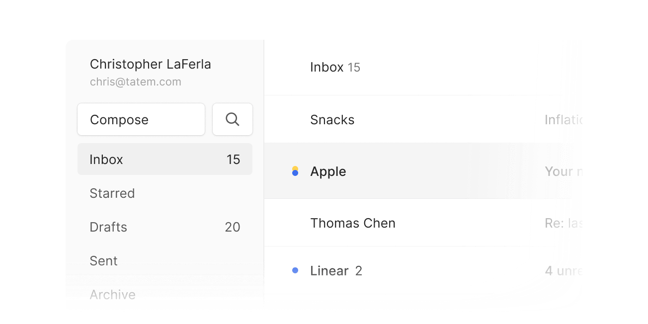
The left sidebar has been redesigned to minimize the amount of screen real estate it takes up. The biggest change aside from the size, is the addition of the “Search” button directly in the sidebar. We did this to help new users immediately feel comfortable in Tatem as the two core action buttons, Compose and Search, are now front and center. Finally, we’ve moved the logo to the bottom of the page as we found it was unnecessarily emphasized. Now, your account information has taken its place at the top of the sidebar. Don't worry though, the the Tatem logo has retained its functionality. Clicking it will still return home.